Designing a landing page that drives waiting list sign-ups isn’t about making something “look nice”. It’s about engineering a page that reduces uncertainty, increases motivation, and makes the next step feel obvious.
For GrantedGiving, the goal was simple: turn interested visitors into waiting list sign-ups.
The way to get there was equally simple (but often overlooked): align the page with how people actually decide.
Here’s the step-by-step process I followed, and why the design works.
Step 1: Starting with the conversion goal (and remove everything else)
Before designing anything, I locked in the single outcome the page needed to produce: Waiting list sign-ups.
That decision shaped everything. The page avoids “nice to have” content that competes with conversion (pricing, product tours, multiple CTAs, long explanations). Instead, the layout repeats one action “Join our waiting list” at the moments users are most likely to be ready.
Why this works: We’re reducing “cognitive load” – conversion rates drop when users are given multiple decisions. One page, one action keeps cognitive load low and intent high.
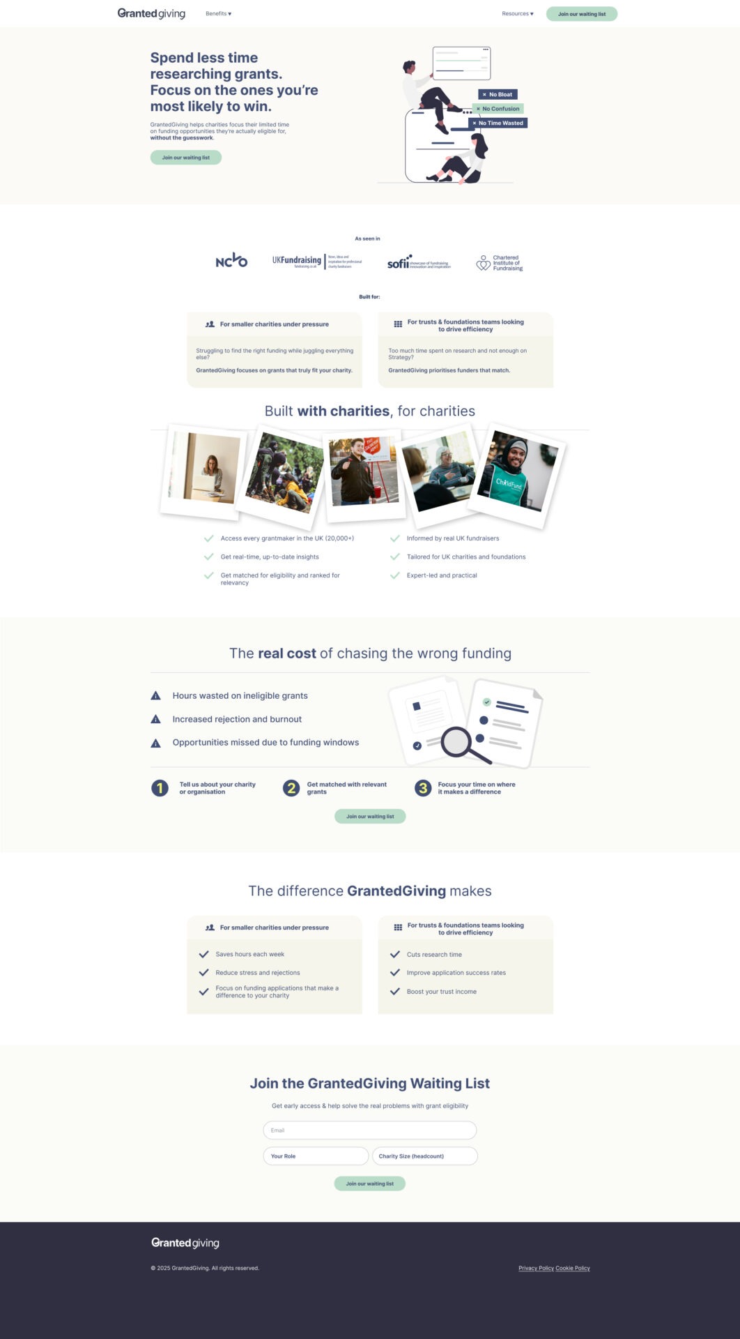
Step 2: Leading with a benefit-led value proposition statement
The hero section doesn’t introduce the product. It introduces the result:
“Spend less time researching grants. Focus on the ones you’re most likely to win.”
This is deliberate. For the target audience, the job isn’t “use a grant platform”, it’s:
- stop wasting time
- avoid rejection
- find funders they’re actually eligible for
- improve success rates
So, the headline is framed around time saved + higher likelihood of success, which is exactly what visitors are hoping for when they arrive.
Why this works: People decide based on outcomes, not features. A clear promise above the fold reduces bounce and increases CTA clicks.
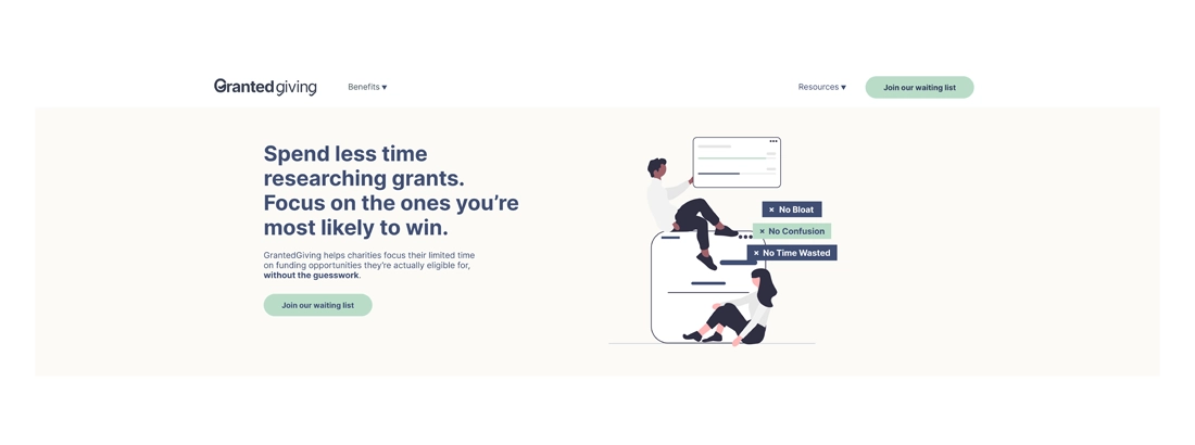
Step 3: Building trust early, before asking for details
Waiting list pages live or die on trust, especially for early-stage products.
The problem is, as with many pre-seed ventures, user stats, client testimonials and other forms of social proof can be hard to come by.
That’s why the page introduces credibility quickly using:
- an “As seen in” logo strip, containing logos of outlets which users are likely to have heard of or previously interacted with.
Why this works: Authority cues reduce perceived risk.
Step 4: Speaking to the two real audiences (without splitting the journey)
The page is designed to match two distinct user mindsets:
- Smaller charities under pressure
- Trusts & foundations teams focused on efficiency
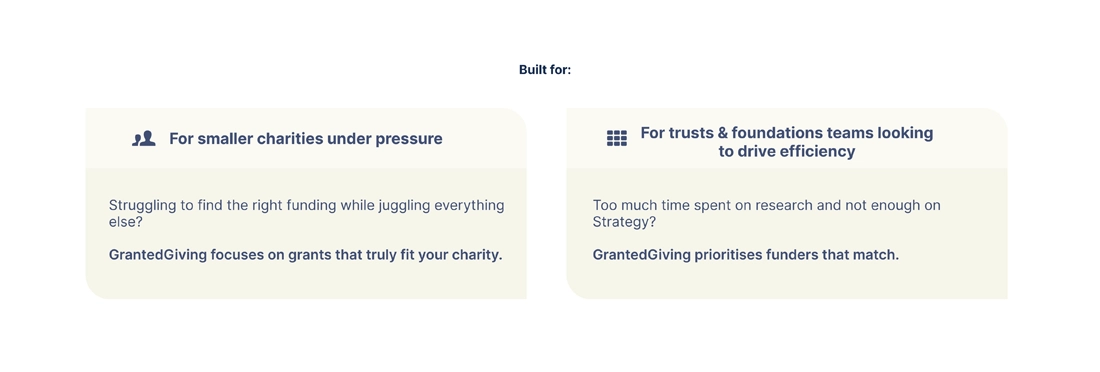
These customer personas were worked-up during a key discovery session with the GrantedGiving team which enabled us to delve into the motivations of two core audience types.
This is deliberate. For the target audience, the job isn’t “use a grant platform”, it’s:
- stop wasting time
- avoid rejection
- find funders they’re actually eligible for
- improve success rates
So, the headline is framed around time saved + higher likelihood of success, which is exactly what visitors are hoping for when they arrive.
Why this works: People decide based on outcomes, not features. A clear promise above the fold reduces bounce and increases CTA clicks.
Step 3: Building trust early, before asking for details
Waiting list pages live or die on trust, especially for early-stage products.
The problem is, as with many pre-seed ventures, user stats, client testimonials and other forms of social proof can be hard to come by.
That’s why the page introduces credibility quickly using:
- an “As seen in” logo strip, containing logos of outlets which users are likely to have heard of or previously interacted with.
Why this works: Authority cues reduce perceived risk.
Step 4: Speaking to the two real audiences (without splitting the journey)
The page is designed to match two distinct user mindsets:
- Smaller charities under pressure
- Trusts & foundations teams focused on efficiency
These customer personas were worked-up during a key discovery session with the GrantedGiving team which enabled us to delve into the motivations of two core audience types.
Persona 1: Survival-focused Sarah
- Head of Fundraising at a small charity
- Time-poor, emotionally depleted
- Facing genuine risk of organisational closure
For Sarah:
- Saving time is not a “productivity win”
- It’s a survival mechanism
- Every wasted application increases risk
Her buying question is not “Is this efficient?”
It’s “Will this help us get through the next 6–12 months?”
Persona 2: Efficiency-focused Edward
- Head of Trusts & Foundations
- Managing a professional fundraising team
- Accountable to leadership and trustees
Edward isn’t firefighting, he’s optimising under scrutiny.
He cares about:
- Relevance ranking
- Strategic defensibility
- ROI per fundraiser
- Futureproofing against tightening eligibility
His buying question is:
“Does this help me run a smarter, more credible trusts strategy?”
Instead of forcing visitors to self-select into separate funnels, both segments are acknowledged in-line. Each group sees their reality reflected back at them (“juggling everything else” vs “too much time spent on research”).
Why this works: relevance is a conversion trigger. When visitors feel “this is for me,” the page doesn’t have to work as hard to persuade.
Step 5: Using Authority Cues to Highlight Relevance
- Positioning statement: “Built with charities, for charities”
- Images clearly aligned to our customer personas
- Core feature & descriptor bullet points
All tell visitors: this isn’t theoretical, and it isn’t built in a vacuum.
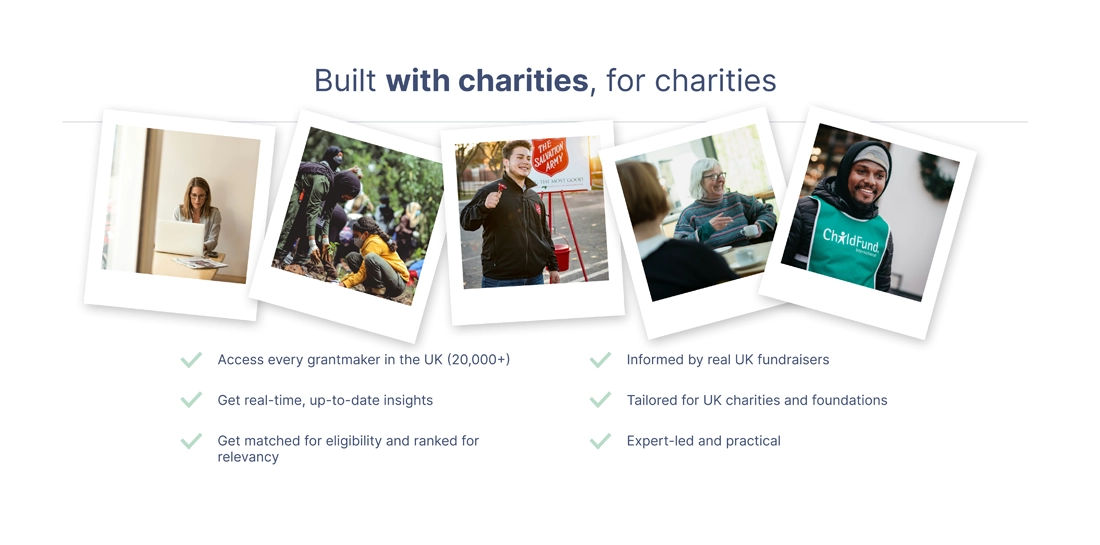
Why this works: These additional authority cues further reduce perceived risk. If users trust the team, they’re far more willing to hand over an email address.
Step 6: Making the pain feel real (then quantify the cost)
After the hero and credibility cues, the page transitions into a problem section:
“The real cost of chasing the wrong funding”
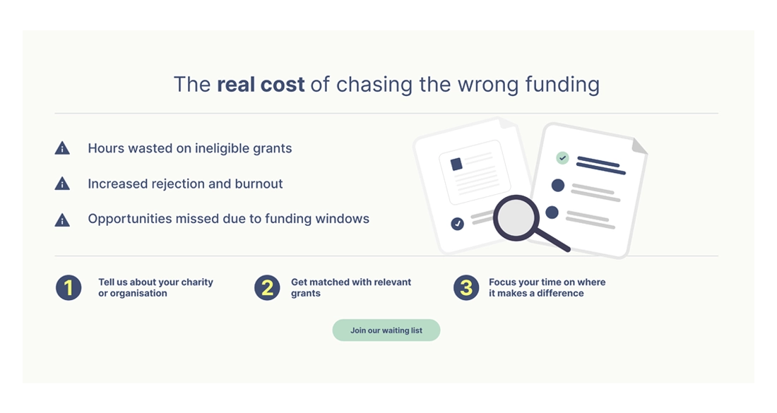
It outlines the consequences clearly:
- hours wasted on ineligible grants
- rejection and burnout
- missed opportunities due to funding windows
This isn’t negativity for the sake of it – it’s framing. If the cost of the problem feels vague, the urgency to act stays vague too.
Why this works: people are more motivated to avoid loss than to chase gain. Naming the cost increases urgency without needing hype.
Step 7: Restoring clarity with a simple 3-step mental model
Once the pain is clear, and the benefits have been highlighted the page offers a simple path forward:
- Tell us about your charity or organisation
- Get matched with relevant grants
- Focus your time where it makes a difference
This is one of the highest-leverage parts of the design.
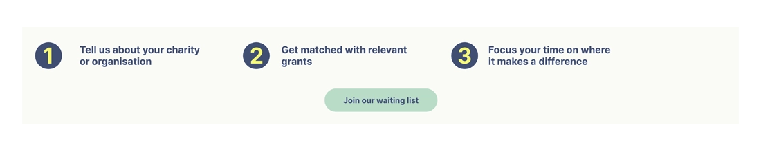
Visitors don’t want complexity, they want to know “how does this work?” without reading paragraphs. The 3-step model makes the product feel easy, guided, and inevitable.
Why this works: simple processes reduce perceived effort. When something feels easy, people are more likely to start.
Step 7: Translating features into benefits (and removing the bloat)
The benefits section avoids generic SaaS claims. It focuses on specific, high-value points for each user type:
For smaller charities under pressure:
- Save hours each week
- Reduce stress and rejections
- Focus on funding applications that make a difference to your charity
For trusts & foundations teams looking to drive efficiency
- Cut research time
- Improve application success rates
- Boost your trust income
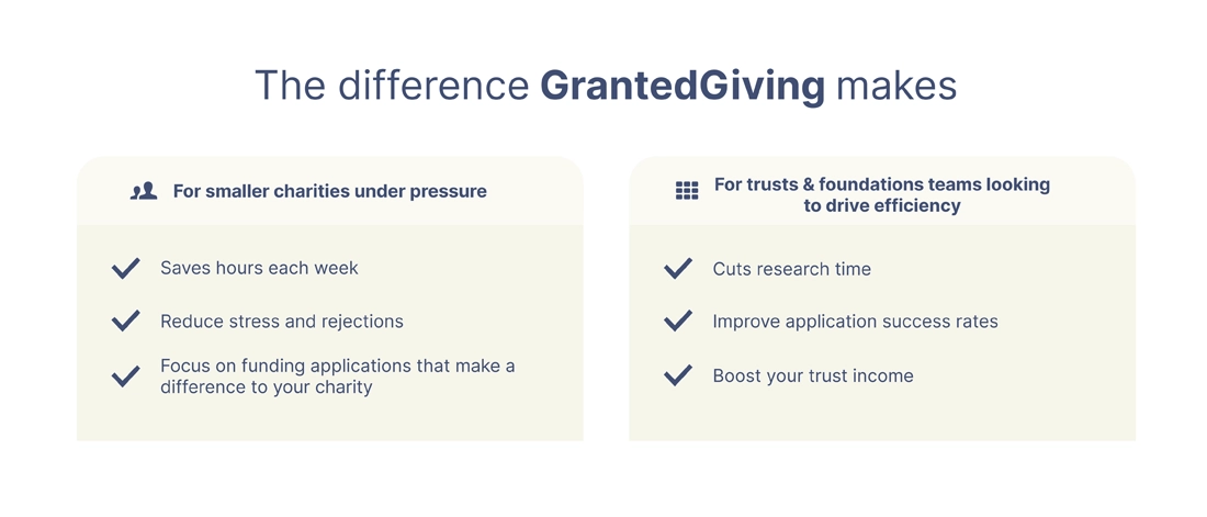
Why this works: features only matter when they’re clearly tied to a job the user is trying to get done. Users care about the value your tool can provide, not features.
Step 8: Keeping the form friction low and the commitment proportional
The sign-up form asks for:
- Role
- Charity size (headcount)
That’s it.
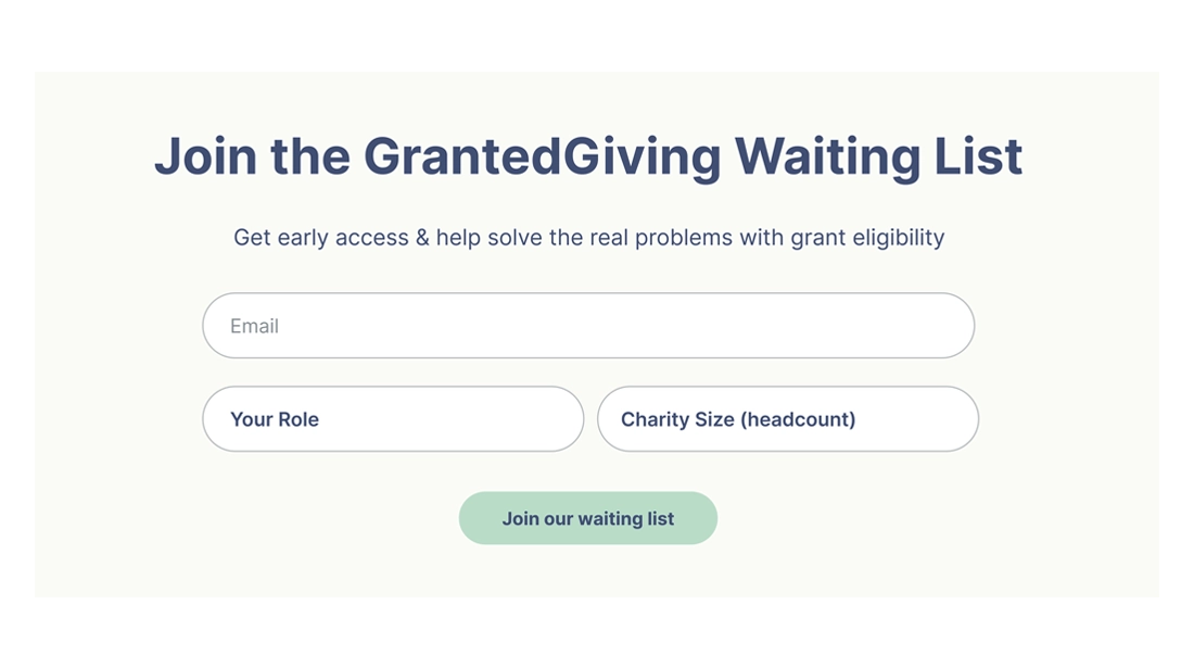
This matters because waiting list sign-ups are a low-commitment action. If the form feels like a sales qualification form, conversions drop. Here, the information requested feels reasonable, and also useful for segmentation later.
Why this works: fewer fields = less friction. And “small ask” forms are consistent with “early access” offers.
Step 9: Repeating the CTA at decision points, not randomly
The CTA appears:
- in the hero (high intent)
- after the problem/solution framing (newly persuaded)
- at the bottom with the full form (end-of-scroll intent)
This isn’t just repetition, it’s timing.
Each CTA placement aligns with a different psychological moment:
- “I’m curious”
- “I get it—this solves my problem”
- “Okay, I’m in”
Why this works: visitors don’t all decide at the same time. Strategic CTA repetition captures intent whenever it peaks.
10. Why this page converts
This landing page works because it’s not just well designed, it’s well-reasoned.
This can be attributed to the process followed before jumping into Figma:
- Clear market segmentation
- Deep persona understanding
- Respect for emotional context
- A single, disciplined conversion goal
The page doesn’t try to persuade everyone.
It speaks clearly to the right people, in language that reflects the pressure they’re already under, and then makes the next step feel obvious.
That’s what conversion-focused design looks like when it starts with strategy, not screens.
Key Takeaways 
This page converts because it does the fundamentals:
✓ One goal, one action
✓ A clear promise above the fold
✓ Trust-building early
✓ Audience-aware messaging
✓ Pain framed in a believable way
✓ A simple “how it works” model
✓ Benefits tied directly to user outcomes
✓ Low-friction sign-up experience
✓ CTAs placed where decisions actually happen
✓ It’s not persuasive because it’s loud, it’s persuasive because it’s aligned.